STING TV
TV Service Interface redesign
Emphasize user-
based content
An innovative and
exciting interface
for the young- technological
customers of STING TV.
User-based content,
rearranged categories.
Easy to use and
especially fun!
TOOLS
Adobe xd, Illustrator, After Effects
SCOPE OF WORK
Research, UX/UI Design, Animation
Existing interface
The interface tries
to be accessable
and give a
“here for you” vibe.
It only covers the
need of tv watching
but lacks excitment.
The categories are
ordered in a wrong way.
In some cases
it annoyed users.
What needs to be done
Sting needs to keep it simple
and convenient.
provide escepism after
a long day.
Give the user
his content first.
Content first
A better arranged interface. Customized,
user-based content as a first priority.


User-based interface
New interface for the
unique customers of STING.
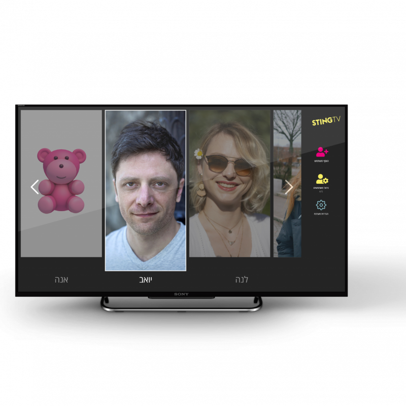
The home screen welcomes the user with
his own profile picture and connects him
to his personal content.


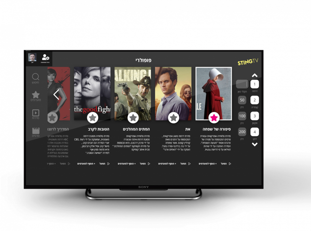
Customisation
Acting on sting’s main vision- user based content.
His favorite shows, movies and
much more at home screen.
Showing the channel bar and
vod on most parts of the interface.


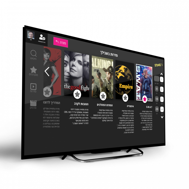
Series page
Selecting a series
from the catalog
will direct the user
to one page
containing all he needs
to know about her.
All episodes and seasons
in one place.


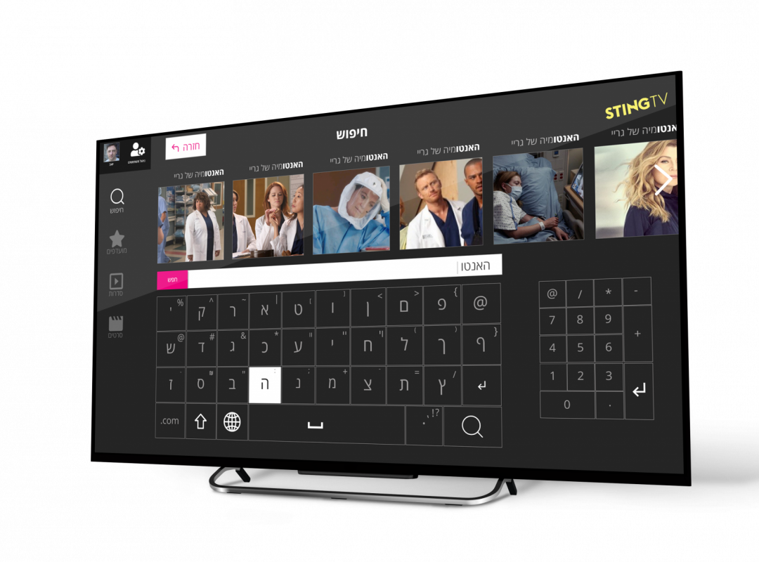
Better Search
Upgraded searching possability. A bigger
virtual keyboard that makes use of the big tv screen. Looped navigation around the keys
for quick results. Highlited keys when clicked.
During the work of
the project, I conducted several interviews with potential users of the
application and identified their main pains.
Research
I conducted a UX
research in wich I found one main audience type.
User Personas
The first stage of research
Stav

Employment
Technical Support
Gender
Woman
Age
34
Pains
- Hates changes.
- dishonesty.
- Low income.
- Longs for company.
Goals
- Preserve what exist in her life.
- Friendships.
- Integrity.
- Needs to consult.
- Pay less and get much more.
Bio
- In a relationship.
- Loves routine.
- Plays a lot of video games
- Binge series on weekends.
- Loves transparency
- Wants to know what she gets for her money.
Challenges
How can I make the interface more user-based?
How can I make the interfac
Easier to use?
What can I keep from the existing interface?
What works?
Rearrange the categories and
make the content the
number one feature.
Make Continue
Watching the first
feature the user see when
he opens his screen.
Enable Channels
& Vod categories
on most screens.
Upgrade the
search option.
Make the use of the interface much
more memorable & reliable.
Solutions
Create a user accounts system. Custom content for each user and give him suggestions based
on shows, series and movies he liked and watched.
Keep the content categories as they exist.
Disassemble the category VOD into
sub categories:
Shows / Series
Movies
Add Favorites category
Interviews Data
During my research I found out how existing users feel when they
watch tv with STING TV.
users

out of

That took a part in the survey and interviews
Said they are not happy with the
interface as it is today.
Most of the complaints were about
the poor speed of the
interface responses to clicks and
switching between channels.
Another complaint regards
pausing content playing,
it's delayed by 2-3 seconds.
users

users

Chose not to rate the categories at all. According to them, there should be
a completely new interface.
Rated the categories as
they exist now
and agreed that they are not in the
right order of use.
users

Answered a short questionnaire
and elaborated about
the use of the existing interface.
users

out of

Said they are not happy with the
navigation on the interface.
users

Rated the categories to their liking.
These are the numbers :
Channels

My content

Series

CatchUp

Kids

Movies

The user is excited.
He gets exactlly what
he wants to
watch in the right moment.
It allows him to feel that he chose well.
The Upgrade
- Gives users an
innovative viewing experience. - Lots of fun and no headaches.
- All of their content is available
in one click. - The menus are simple to navigate in and the content is attractive especially for them.
Using straight shapes and lines reflects a
powerfull message.
The interface style is very innovative. It invites the user to have power at the tip
of his fingers and the joy that comes with a product
personally made for him.

Visual Identity
The color pallete of STING TV
Is right on spot.
Sting promise a
cutting edge technology
with a streamer that turns any tv
to a smart one.
The pale blue reflects that
.innovative approach
Sting also wants their users
to have lots of pleasure.
The fierce pink totally gets it.
The interface invits the users to have the power to choose what they want to watch and how much they want to pay for it. They created a magnificent world of content for them.
The light yellow means power as well as charm.
Flipping through series
on Continue Watching category
Screens
Movie trailer play-
click to play
Episode play-
click to play
Series trailer play-
click to play
SiteMap

Wireframes
כל הזכויות שמורות © למעיין בן דוד עיצוב גרפי 2021
